柱状图#
%matplotlib inline
import matplotlib.pyplot as plt
import numpy as np
# matplotlib加入中文支持
plt.rcParams['font.sans-serif'] = ['Arial Unicode MS']
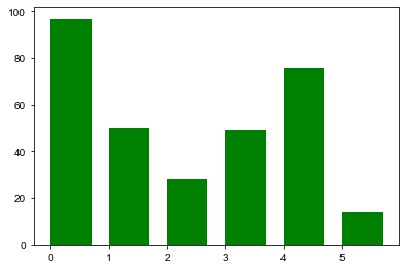
基本柱状图#
x = np.random.randint(1, 100, 6)
height: 高度
width: 宽度
color: 颜色
align: 对齐方式 (center,edge)
label: 名字
# 垂直柱状图
plt.bar(np.arange(6), height=x, width=0.7, color="green", align="edge", label="vertical")
plt.show()
水平柱状图#
y = np.random.randint(1, 120, 6)
height = 0.4
# 水平柱状图
plt.barh(np.arange(6) - height/2, width=x, height=height, label="base version")
plt.barh(np.arange(6) + height/2, width=y, height=height, label="new version")
plt.legend()
plt.show()

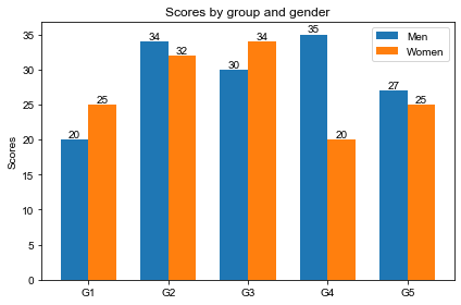
柱状图上标明数字#
labels = ['G1', 'G2', 'G3', 'G4', 'G5']
men_means = [20, 34, 30, 35, 27]
women_means = [25, 32, 34, 20, 25]

x = np.arange(len(labels))  # the label locations
width = 0.35  # the width of the bars
fig, ax = plt.subplots()
rects1 = ax.bar(x - width/2, men_means, width, label='Men')
rects2 = ax.bar(x + width/2, women_means, width, label='Women')

# Add some text for labels, title and custom x-axis tick labels, etc.
ax.set_ylabel('Scores')
ax.set_title('Scores by group and gender')
ax.set_xticks(x)
ax.set_xticklabels(labels)
ax.legend()


def autolabel(rects):
    """Attach a text label above each bar in *rects*, displaying its height."""
    for rect in rects:
        height = rect.get_height()
        ax.annotate('{}'.format(height), # 显示的text
                    xy=(rect.get_x() + rect.get_width() / 2, height), # text的位置
                    ha='center', # 水平方向中间对齐
                    va='bottom') # 垂直方向下对齐


autolabel(rects1)
autolabel(rects2)
fig.tight_layout() # 确保不会重叠
plt.show()